Redefine the way friends choose dates to meet up.
Project
Status
Personal
Prototype
Role
Activities
UX / Product Design
Desk research | Competitor Analysis | Usability review | User flows | User testing | Prototyping
Simplify the process of selecting dates for friends to meet up.
Long have I observed groups of friends delay their get-together, resulting in short-term frustration and long-term estrangement. In most cases, this was due to busy schedules and a lack of agreement on a suitable date for everyone involved.
I set out to solve this issue by creating an app that would assist you in locating the best date in the easiest and fastest way possible.
Research
What are some of the current solutions, and what can I learn from them?
Existing solutions are inadequate for informal settings.
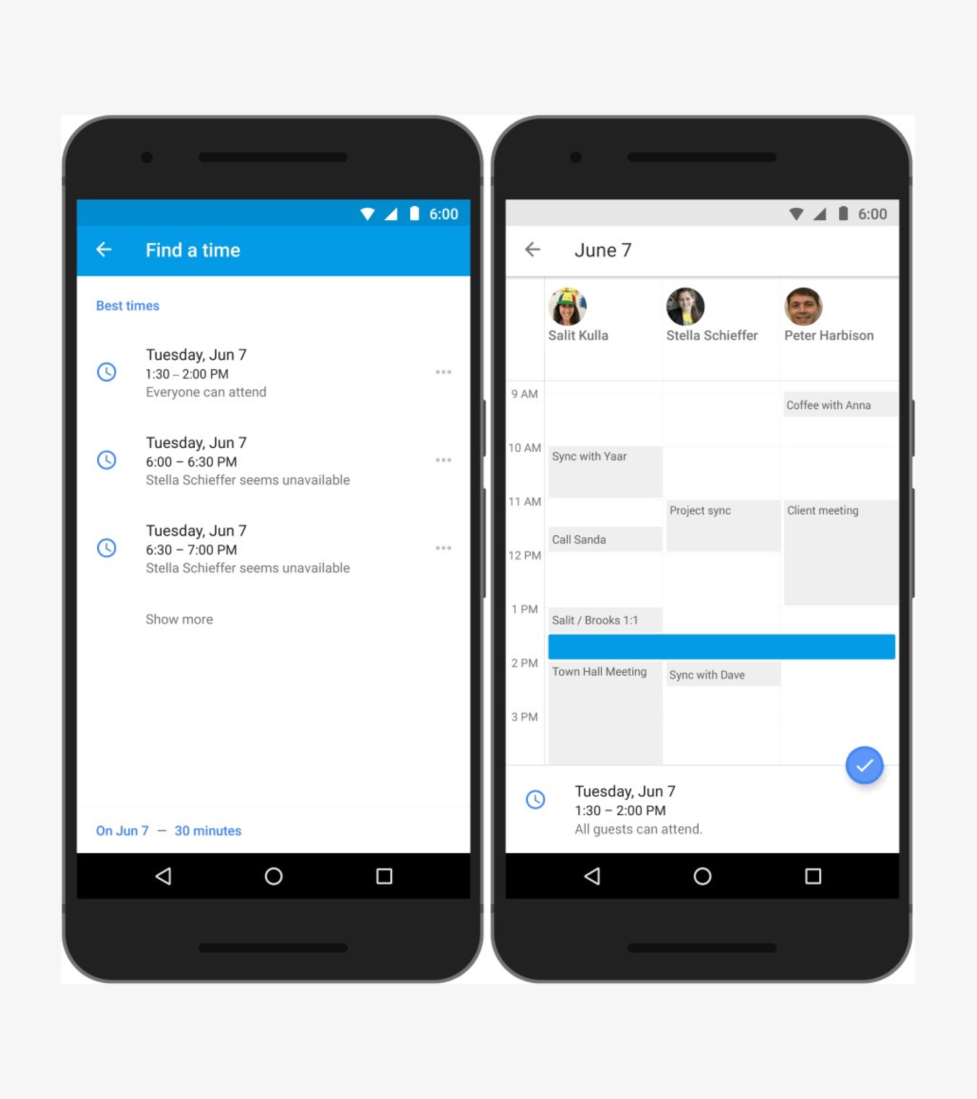
Scheduling a slot is easy with tools like Google Calendar, which show participants' availability. However, for informal gatherings, friends often use different scheduling tools, rely on third-party apps to pick dates, or propose dates via chat.
Most common solution is too complicated.
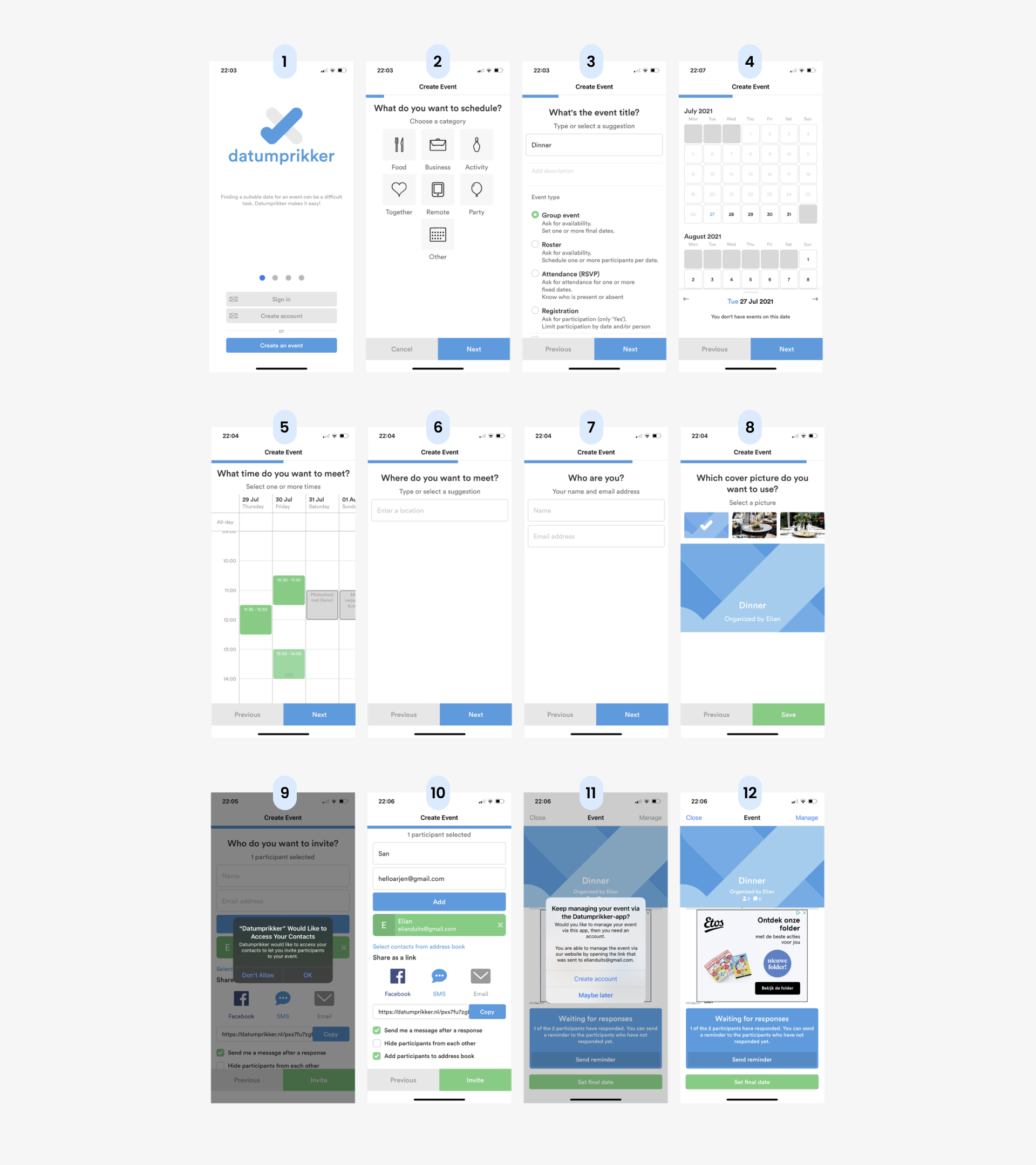
Datumprikker, the go-to tool for selecting dates in the Netherlands, is too complicated and time-consuming. Creating an event takes no less than twelve steps. Many people have reverted to suggesting dates via messaging apps. Seeing the need for a better alternative, I sought a more efficient solution.
Ideation
Exploring areas of opportunity to find solutions.
Simplify the flow to focus on the essence.
I analyzed Datumprikker to find ways to improve it. I wondered if date sharing could be as simple as sharing a GIF, since the main function is just selecting and sharing dates. It seemed unnecessary to burden users with extra input requirements.
A seamless date and time picker to create the best user experience.
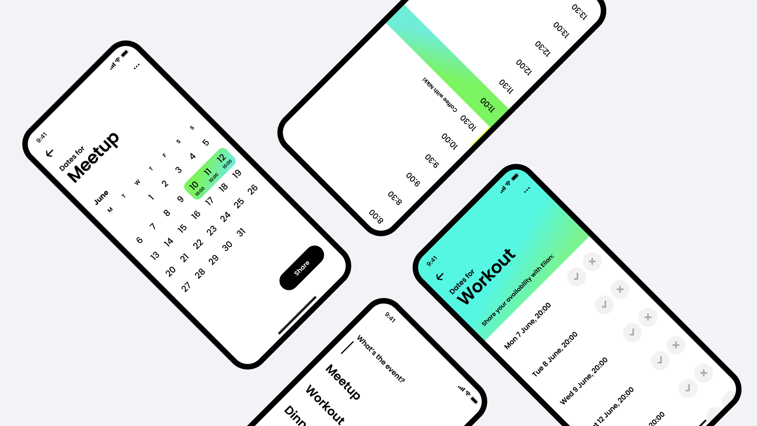
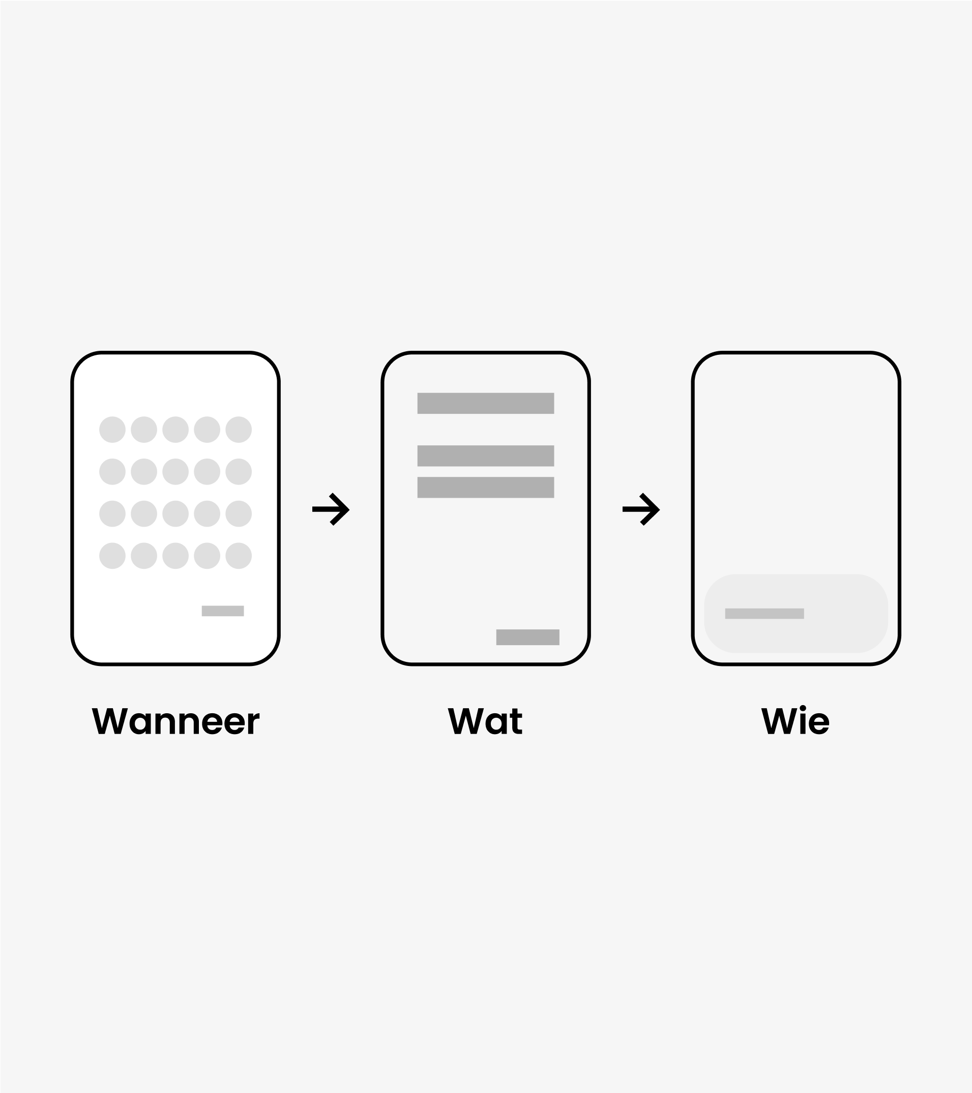
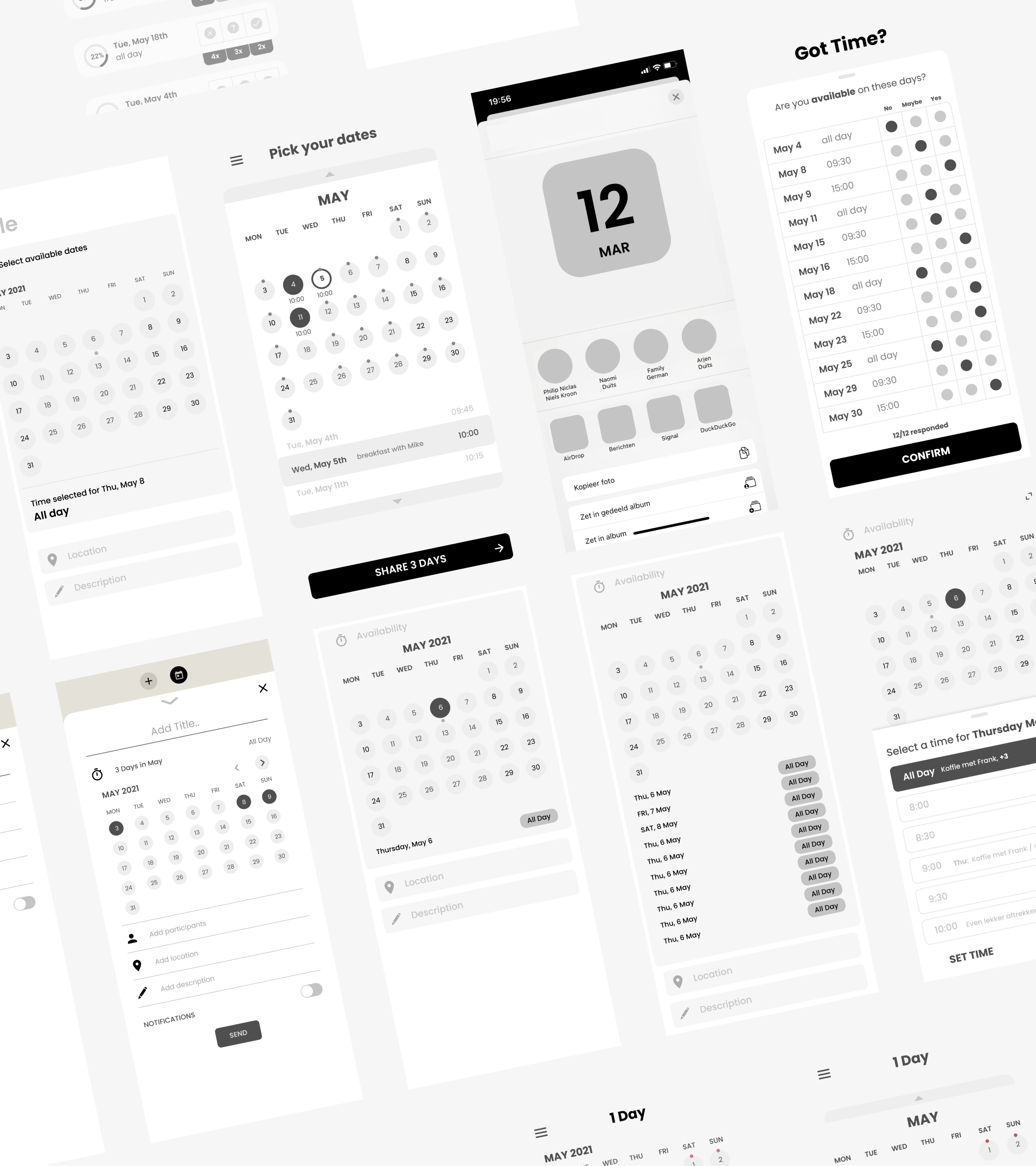
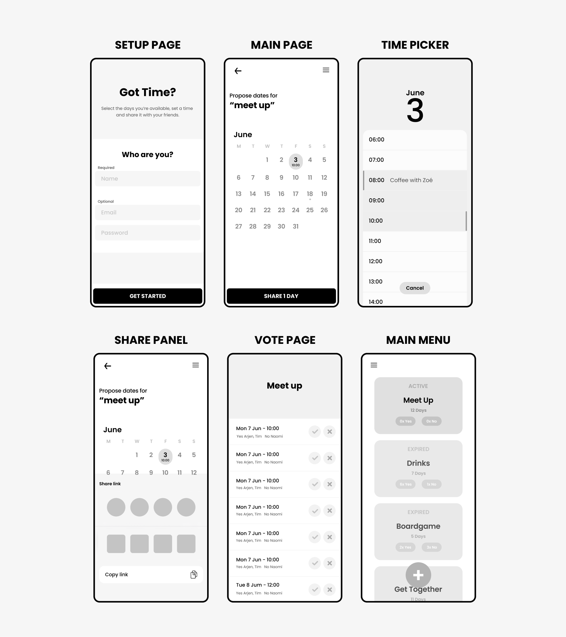
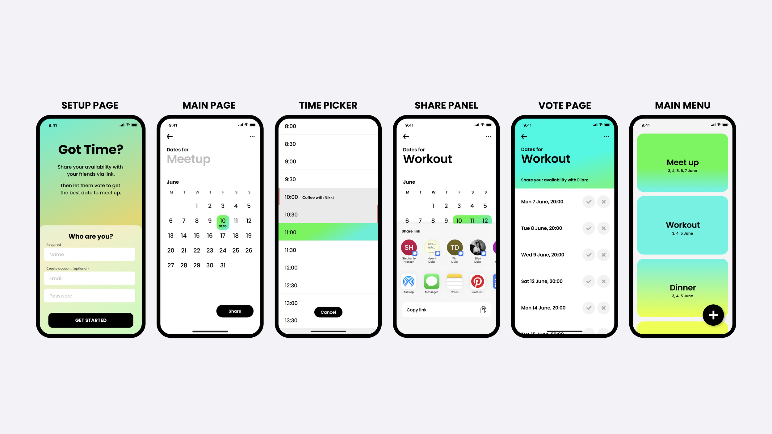
My goal was to streamline the service by consolidating essential features into a few pages for the best user experience. I discovered that making date and time selection seamless was crucial. The solution was a full-screen time picker, removing the end time option, which seemed unnecessary for casual meetups.
Results
Share with friends via link. That simple.
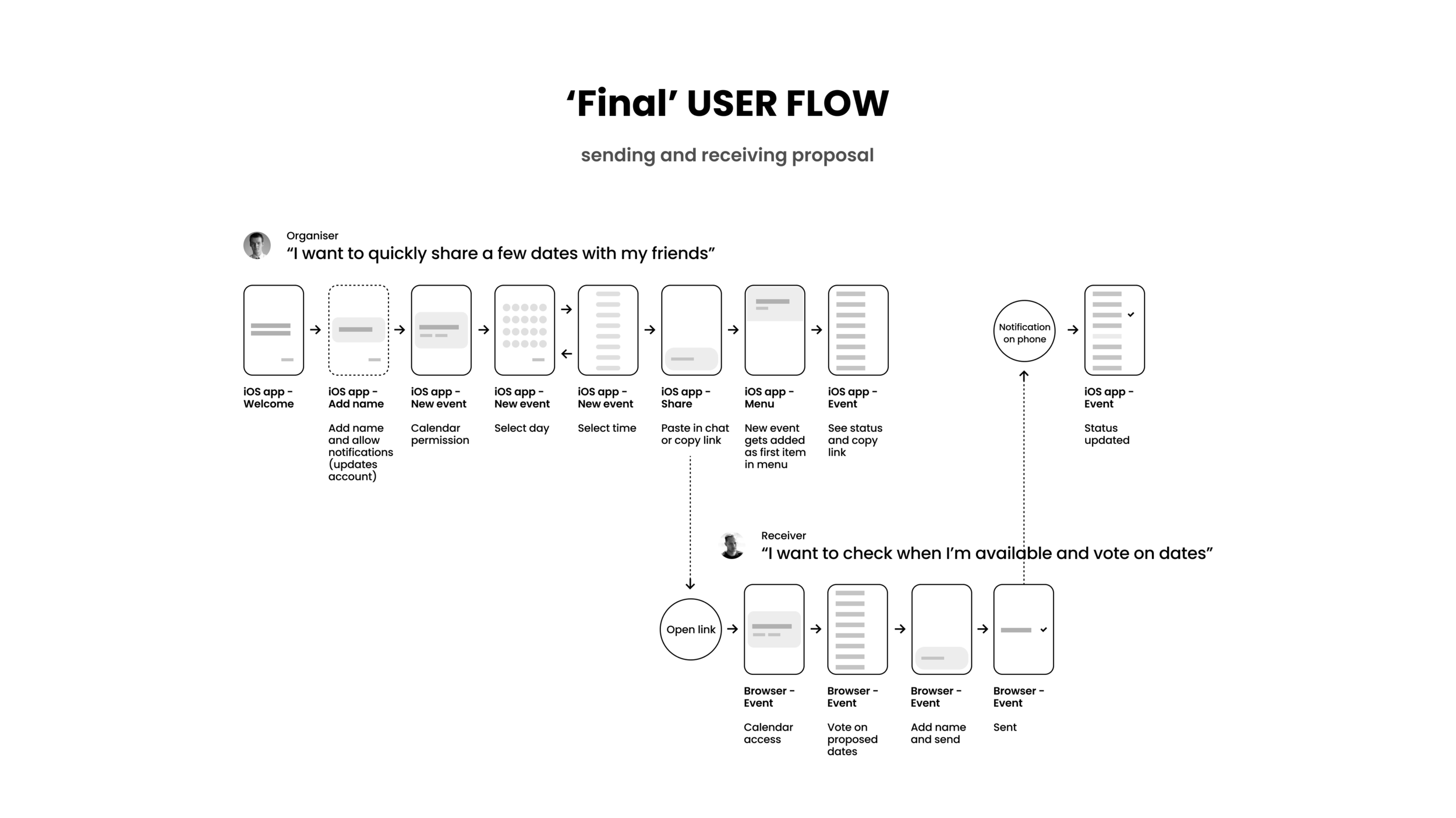
The service is completed with a share button located at the bottom, which displays a panel allowing users to share a link with their friends. Upon opening the link, a web page appears where friends can vote on the most suitable date for them.
Finding the visual tone of voice.
The project involved mapping the user journey: selecting a date and time, sharing via link, then returning to the main menu to monitor responses and set the final date. Account creation is optional. I streamlined the prototype to one or two pages from eight, providing a compelling alternative to Datumprikker.
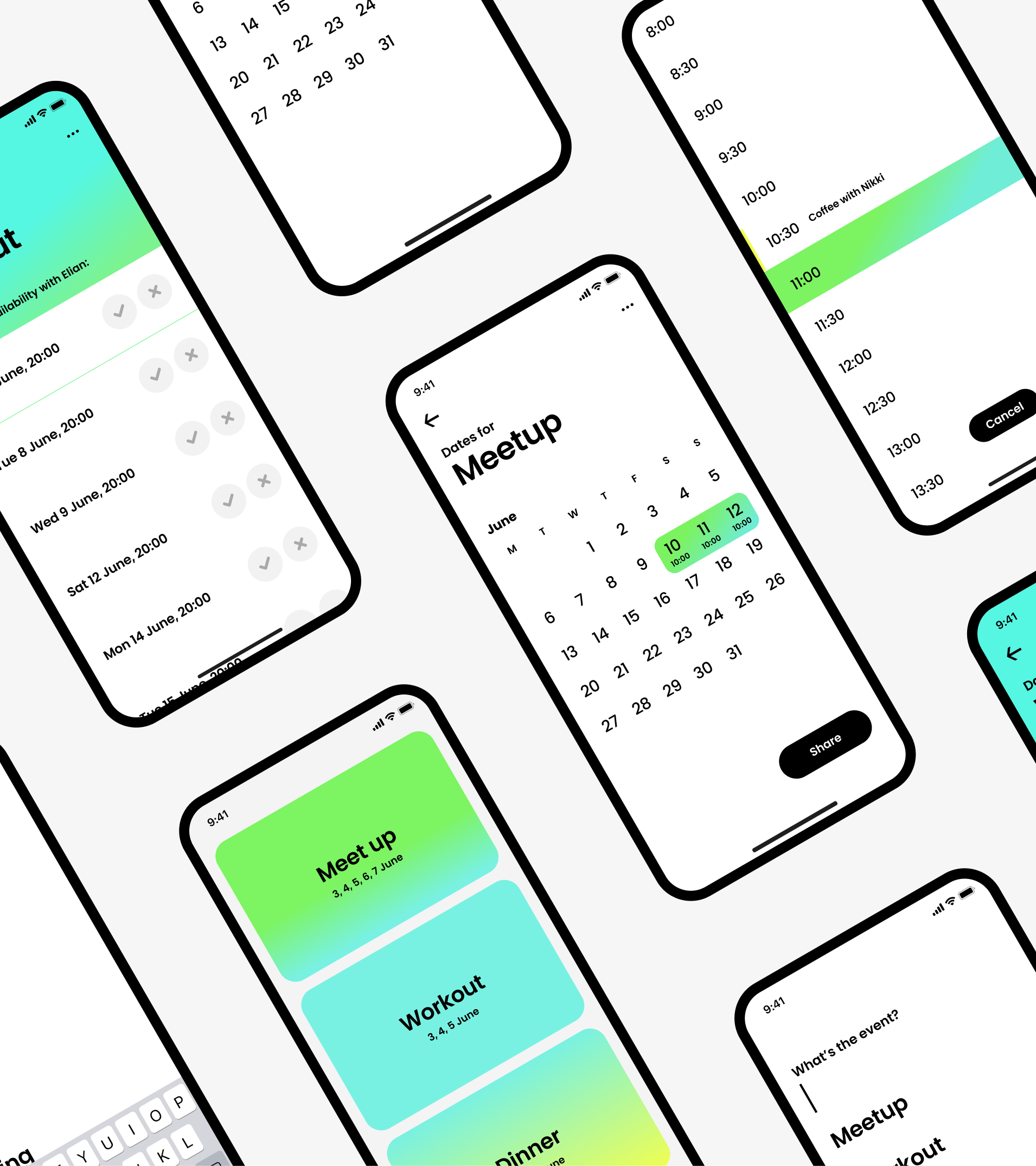
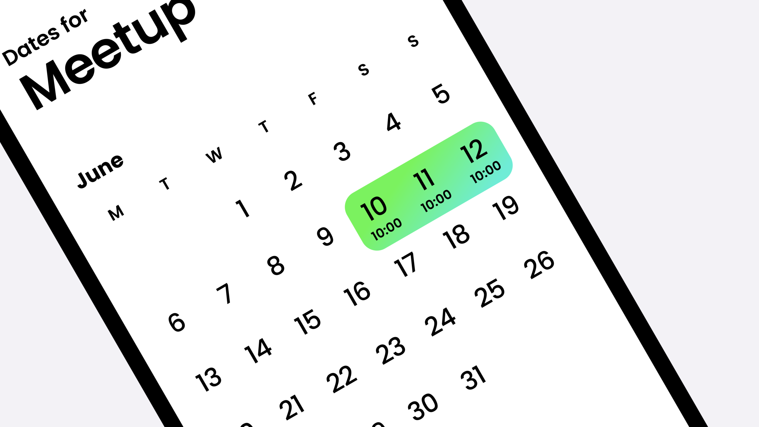
Visually, I aimed for simplicity with vivid gradient colors to enhance key features, adding vibrancy without compromising the clean aesthetic.

